2020 | RED TICCA Branding |
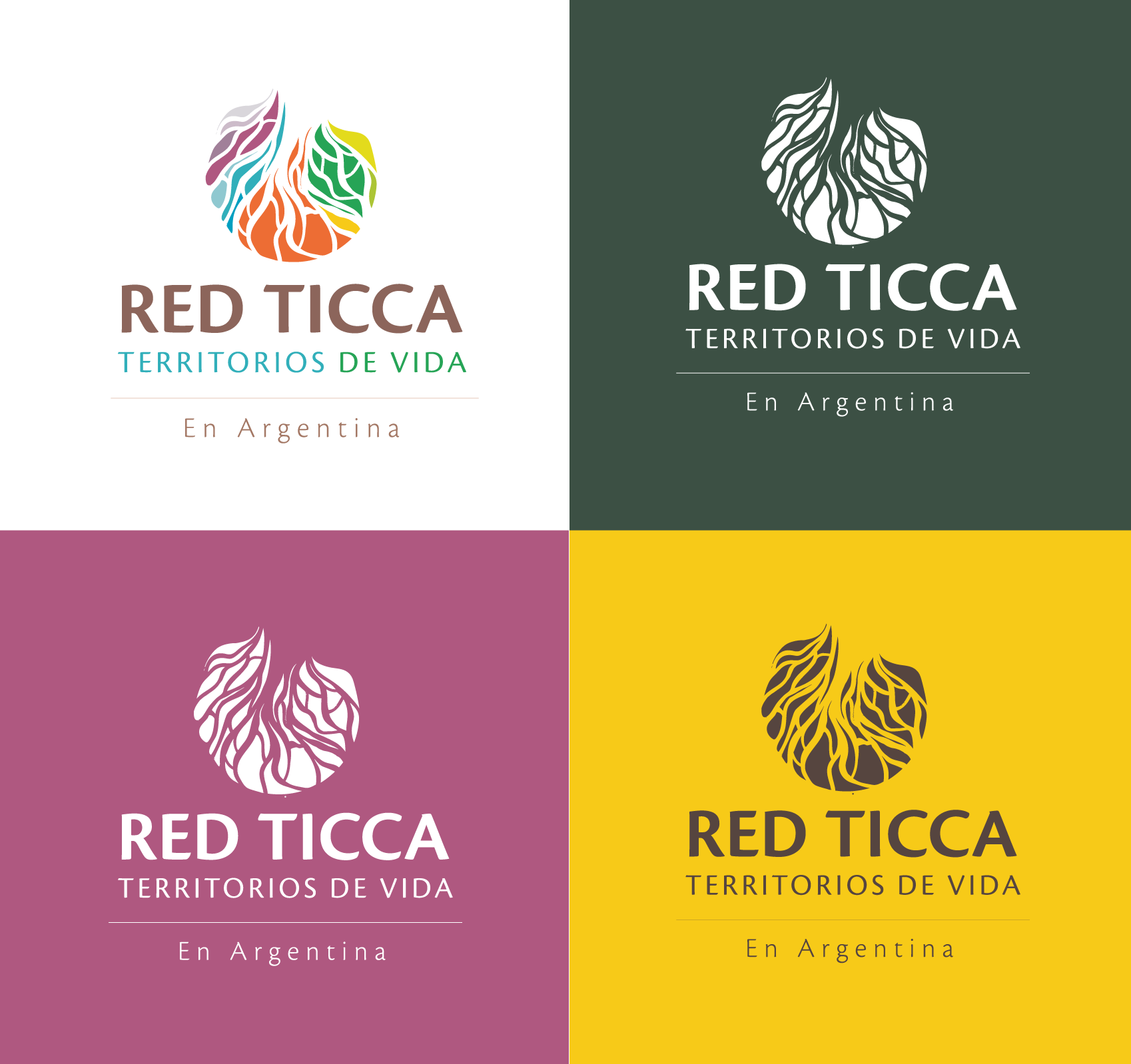
Development of a graphic system with logo and visual identity, in collaboration with the United Nations (UN) and the University of Buenos Aires (UBA).
The project was funded by the United Nations (UN), as part of its programs supporting Indigenous peoples and biodiversity conservation, and was carried out by the University of Buenos Aires (UBA) in collaboration with the TICCA Network.
In this context, I was selected to create the brand and develop a graphic system that shaped a visual identity, capable of representing the essence of the Network: the unity and diversity of Indigenous peoples, memory and resistance, and the ancestral bond with the land.
The aim of the work was to consolidate a common and representative image, one that would strengthen the visibility of Indigenous peoples and support their struggle for recognition and the protection of their territories of life.
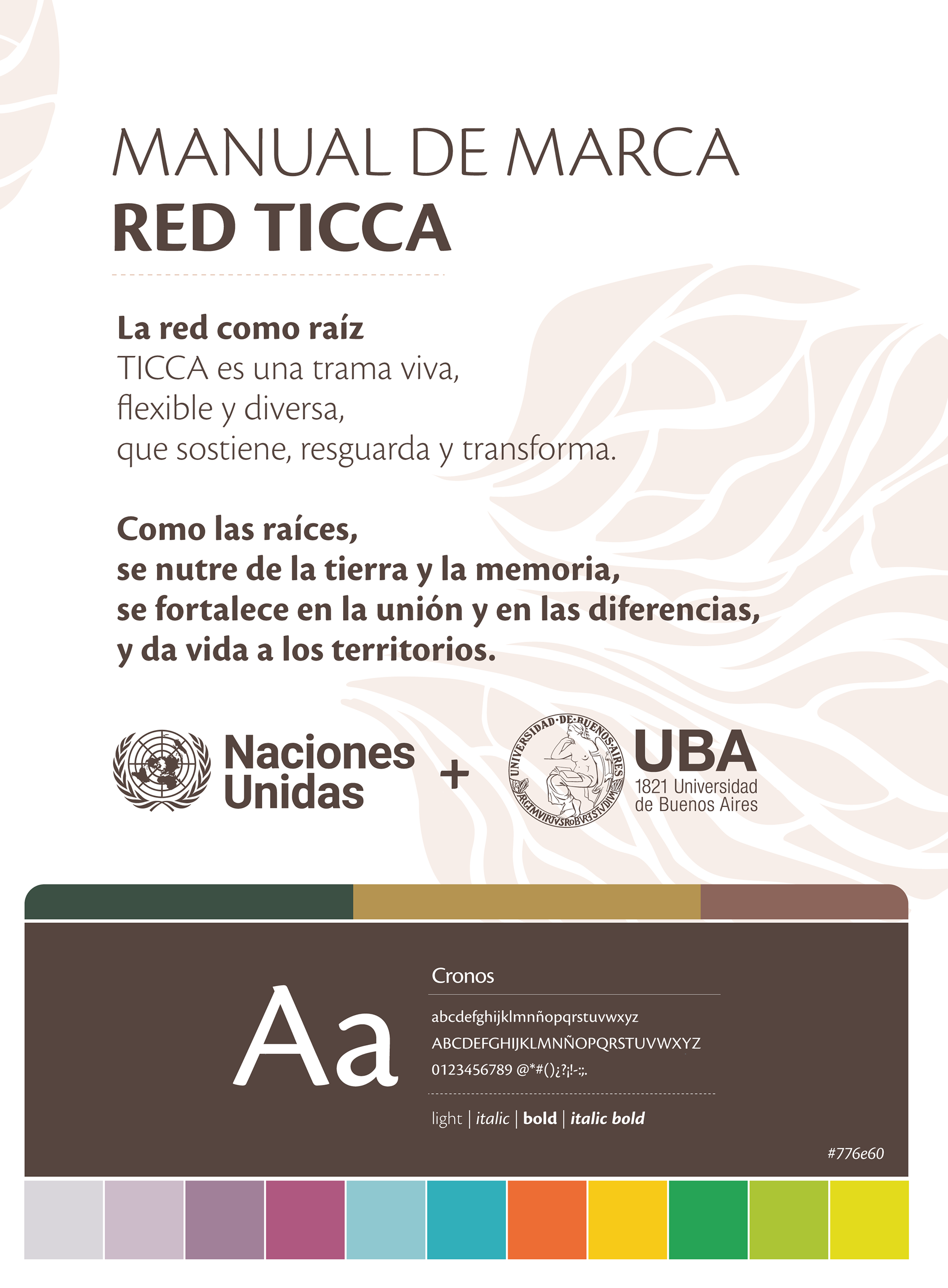
The Network as Root
TICCA is a living fabric, flexible and diverse, that sustains, safeguards, and transforms.
Like roots, it is nourished by the land and memory, strengthened by unity and differences, and it gives life to the territories.
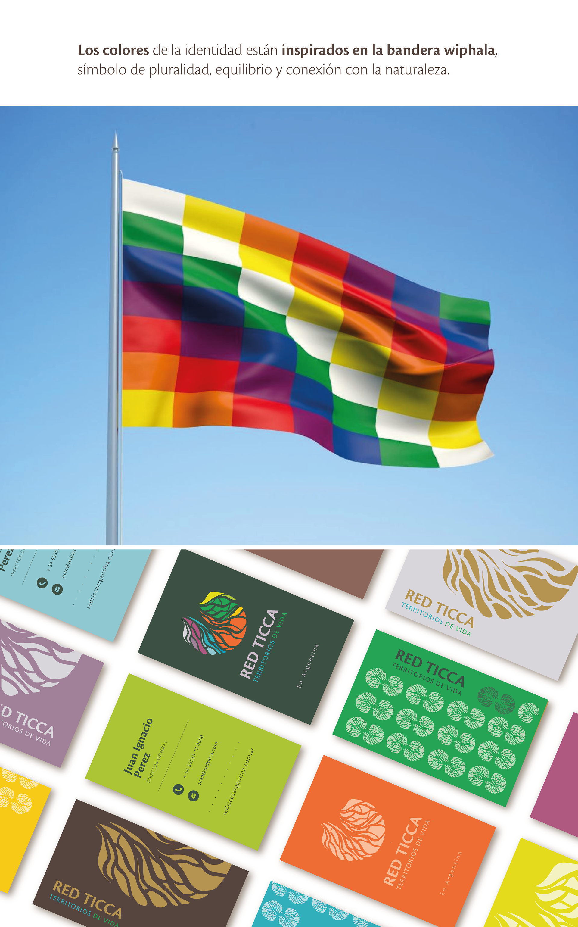
The colors of the identity are inspired by the Wiphala flag, a symbol of plurality, balance, and connection with nature.