2025 | EOLDevelopment of the visual identity for the Escuela de la Orientación Lacaniana (EOL).
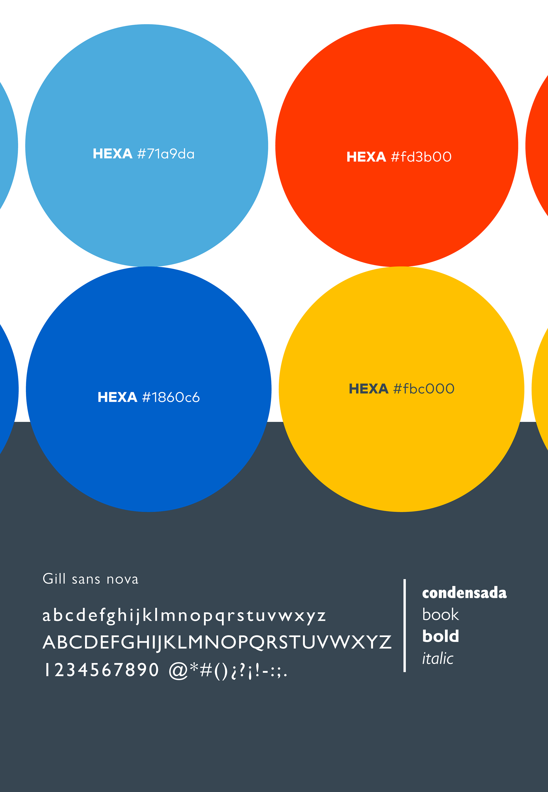
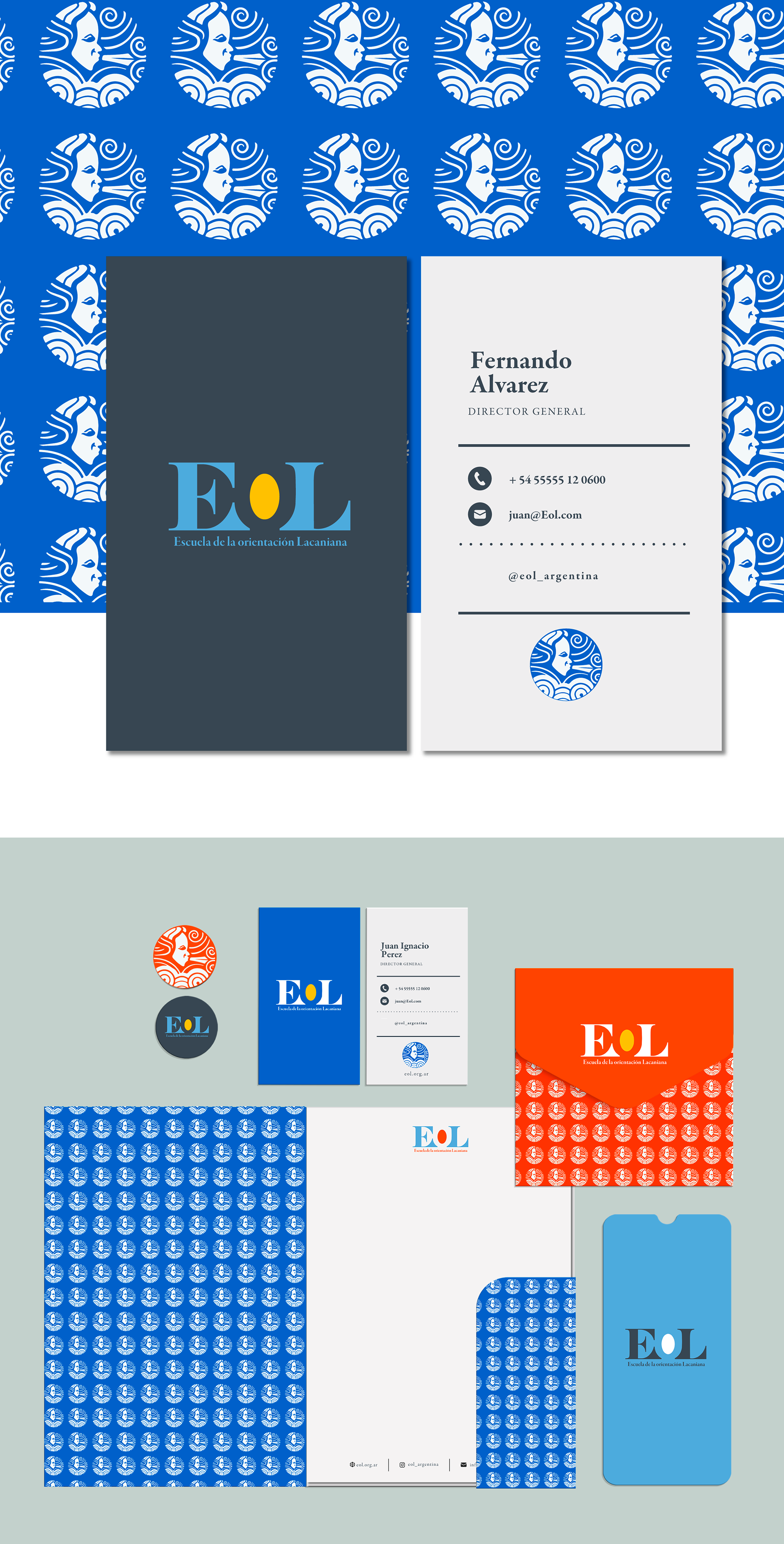
Branding work and redesign of the institutional brand.
Branding work and redesign of the institutional brand.
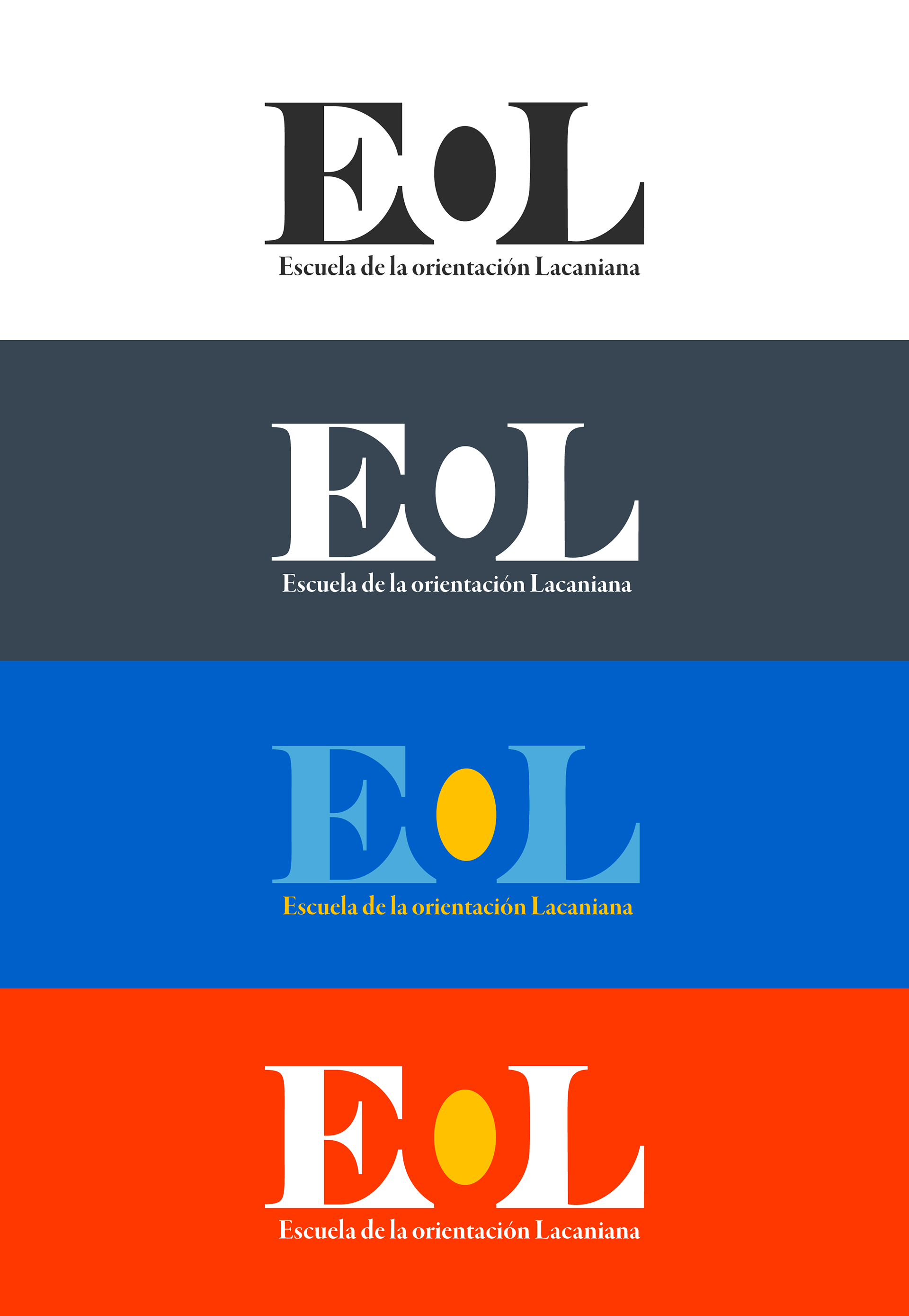
Concept: Void — The Defining Absence
Inspired by the phrase “Like a cauldron that marks a void at whose bottom one can see oneself reflected,” the concept begins with the idea of the void as a defining lack.
Inspired by the phrase “Like a cauldron that marks a void at whose bottom one can see oneself reflected,” the concept begins with the idea of the void as a defining lack.
Attributes: Discomfort | The Unspeakable | Depth | Mystery | Pain | Drive | Desire
The void is expressed in the letter “O” through its counterform, where absence becomes structure.
It is not a mere lack, but an active space that reveals, conceals, and provokes.
The design makes visible that what is missing also builds.
It is not a mere lack, but an active space that reveals, conceals, and provokes.
The design makes visible that what is missing also builds.
2025 | EOL Conference
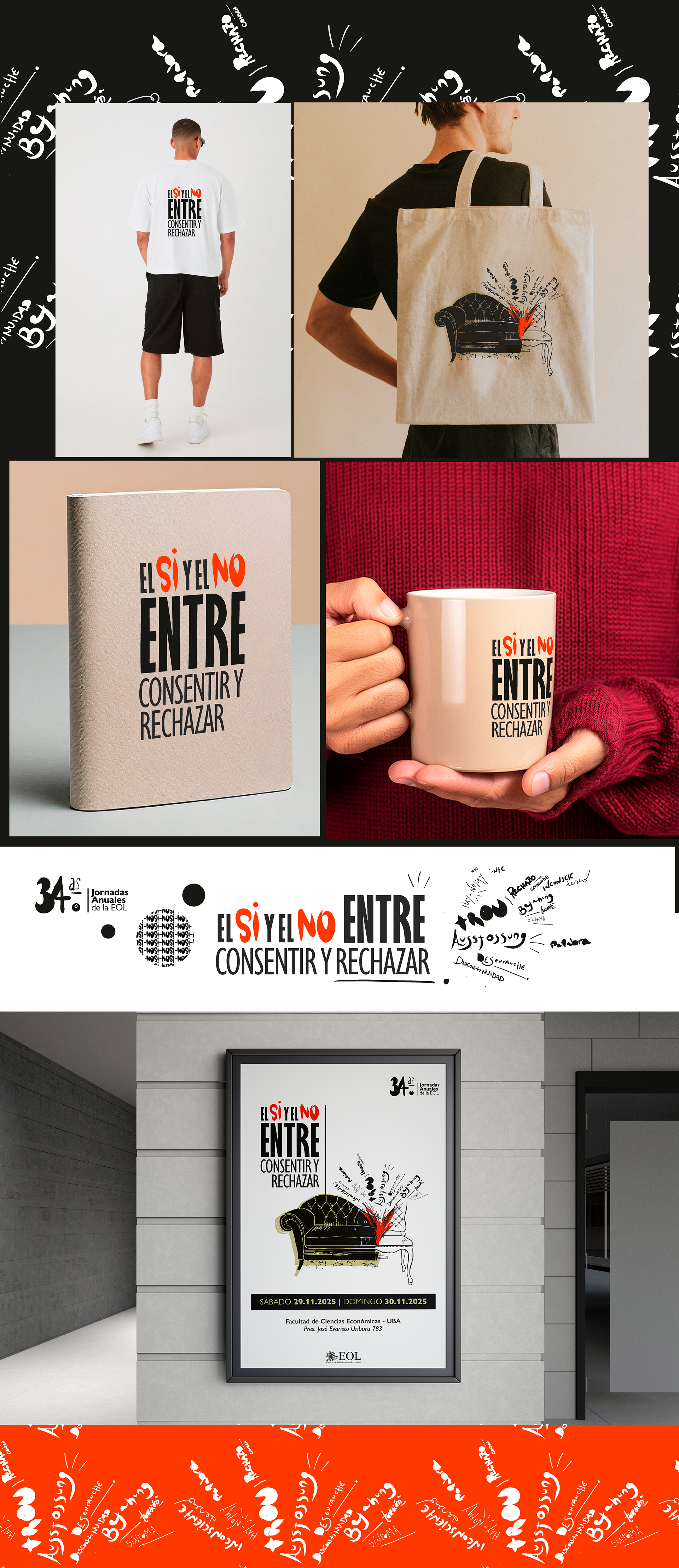
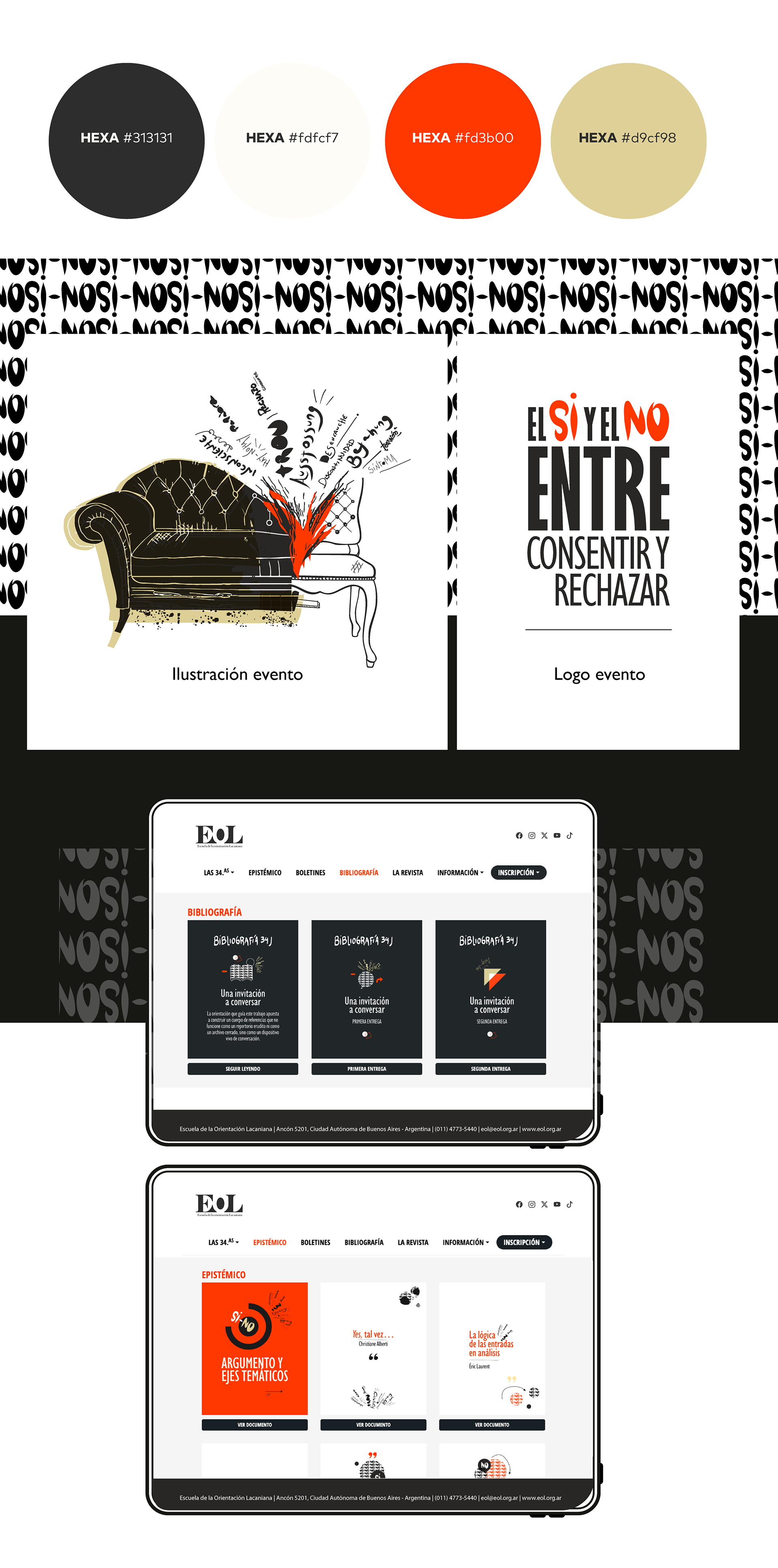
Development of the visual identity for the 2025 EOL Conference, including a complete graphic system designed for the event — logo and illustrations — based on a conceptual and research-driven exploration of the theme “Yes and No: Between Consenting and Rejecting.”
Logo Concept:
The title — “Yes and No. Between Consenting and Rejecting” — takes shape within the poster. The word “between” is enlarged, marking a zone of friction without reconciliation — a place where no seamless union is possible. It points to interruption, doubt, and ambiguity; it never fully defines a whole. It represents transition — a passage.
The title — “Yes and No. Between Consenting and Rejecting” — takes shape within the poster. The word “between” is enlarged, marking a zone of friction without reconciliation — a place where no seamless union is possible. It points to interruption, doubt, and ambiguity; it never fully defines a whole. It represents transition — a passage.
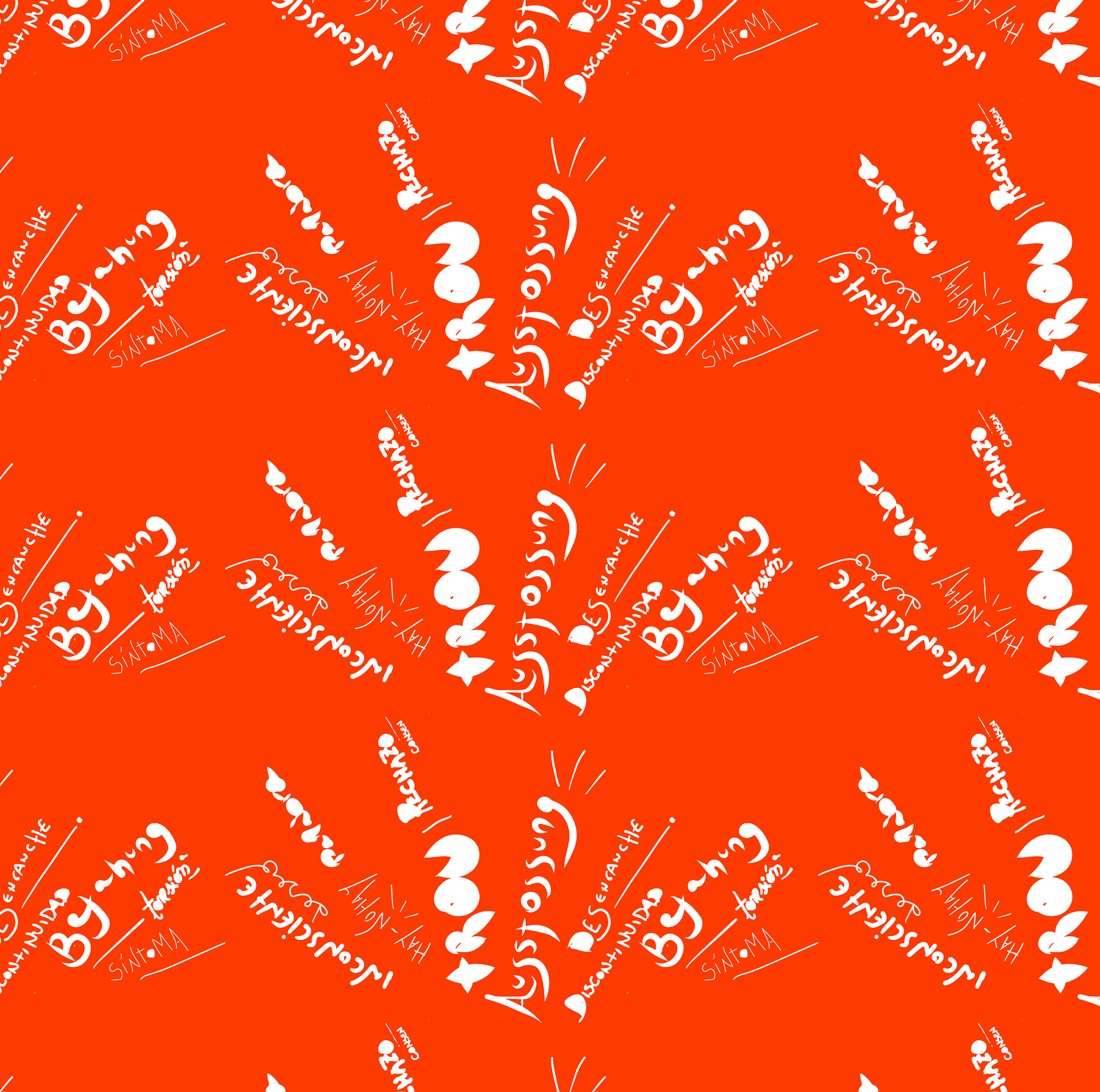
The concept also echoes the operations of Bejahung (affirmation) and Ausstossung (rejection): forces that simultaneously establish and divide. The “S” and “N” from “Sí” and “No” mirror each other vertically, emphasizing opposition — a reflection that doesn’t align. The gestural quality of these words heightens the tension and expressiveness of the yes and the no.
The poster presents a disjointed scene: a split couch, out of alignment, exploding into opposing words that nonetheless touch. A sideways form of speech that, in its very detour, says something — a saying directed toward the analyst.
This out of register, this displacement, creates a visual unease that may allude to the way the unconscious manifests itself in analysis: sideways, through ambiguity, detour, and symptom. It evokes what does not close, what breaks through.
Website Development for the EOL Conference
Design and development of the EOL 2025 Conference website, conceived as a visual and conceptual extension of the event’s identity. The proposal integrates the graphic system and visual resources created for the brand, resulting in a coherent, clear, and seamless browsing experience.
Design and development of the EOL 2025 Conference website, conceived as a visual and conceptual extension of the event’s identity. The proposal integrates the graphic system and visual resources created for the brand, resulting in a coherent, clear, and seamless browsing experience.
Visit the website: Click aquí .